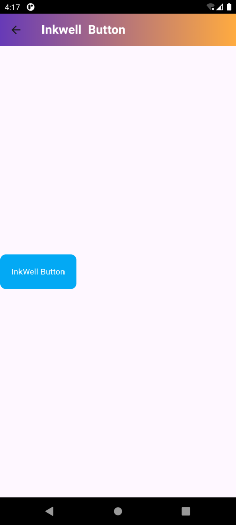
InkWell is a widget in Flutter that adds an ink splash effect to its child widget when tapped. It’s commonly used to provide visual feedback for tap interactions
The InkWell widget in Flutter adds a visually appealing ripple effect to widgets, providing instant feedback when users interact with them through touch. It’s perfect for creating engaging, interactive elements like buttons, list items, or any other tappable UI components that benefit from a dynamic, responsive feel
- InkWell widget creates a dynamic visual response, simulating a ripple effect, to acknowledge and enhance user interactions, providing a tactile-like experience.
Differences between GestureDetector and InkWell in Flutter:
GestureDetector:
- Detects gestures (taps, swipes, pinches, etc.) on a widget.
- Provides callbacks for various gestures (onTap, onDoubleTap, onLongPress, etc.).
- Does not provide visual feedback.
- Can be used with any widget.
InkWell:
- Provides a material design ripple effect on tap.
- Indicates user interaction with visual feedback.
- Limited to tap gestures (no swipe, pinch, etc.).
- Typically used with flat widgets (like buttons, and list items).
InkWell Properties:
- onTap: Callback for tap events.
- onDoubleTap: Callback for double-tap events.
- onLongPress: Callback for long-press events.
- splashColor: Color of the ink splash.
- highlightColor: Color of the highlight overlay.
- child: The widget to wrap with the ink splash effect.
InkWell is often used with GestureDetector to handle multiple gestures:
InkWell(
  onTap: () {},
  child: GestureDetector(
    onTap: () {},
    onDoubleTap: () {},
    child: Container(...),
  ),
)
Code
import 'package:flutter/material.dart';

// Define a StatefulWidget called InkewllbuttonDemo
class InkewllbuttonDemo extends StatefulWidget {
  // Constructor for the StatefulWidget
  const InkewllbuttonDemo({Key? key}) : super(key: key);

  @override
  State<InkewllbuttonDemo> createState() => _InkewllbuttonDemoState();
}

// State class for InkewllbuttonDemo
class _InkewllbuttonDemoState extends State<InkewllbuttonDemo> {
  @override
  Widget build(BuildContext context) {
    return SafeArea(
      // SafeArea widget ensures that the child widgets are not obstructed by system UI areas
      child: Scaffold(
        // Scaffold provides a basic structure for the visual interface
        appBar: AppBar(
          // AppBar is a material design app bar that appears at the top of the screen
          title: Text(
            "InkWell Button",
            style: TextStyle(
              color: Colors.white, // Set the text color to white
              fontWeight: FontWeight.bold, // Make the text bold
            ),
          ),
          flexibleSpace: Container(
            // Container inside AppBar to apply a gradient decoration
            decoration: BoxDecoration(
              gradient: LinearGradient(
                // Apply a linear gradient to the AppBar
                colors: [Colors.deepPurple, Colors.orangeAccent], // Gradient colors
                begin: Alignment.topLeft, // Gradient starts from the top left
                end: Alignment.topRight, // Gradient ends at the top right
              ),
            ),
          ),
        ),
        body: Column(
          // Column arranges its children vertically
          mainAxisAlignment: MainAxisAlignment.center, // Center the children vertically
          children: [
            InkWell(
              // InkWell widget provides material ripple effect on tap
              onTap: () {
                // Callback when the InkWell is tapped
                ScaffoldMessenger.of(context).showSnackBar(
                  SnackBar(content: Text('InkWell tapped!')), // Show a SnackBar with a message
                );
              },
              onDoubleTap: () {
                // Callback when the InkWell is double-tapped
                ScaffoldMessenger.of(context).showSnackBar(
                  SnackBar(content: Text('InkWell double tapped!')), // Show a SnackBar with a message
                );
              },
              onLongPress: () {
                // Callback when the InkWell is long-pressed
                ScaffoldMessenger.of(context).showSnackBar(
                  SnackBar(content: Text('InkWell long pressed!')), // Show a SnackBar with a message
                );
              },
              borderRadius: BorderRadius.circular(10), // Apply rounded corners to the ripple effect
              splashColor: Colors.blue.withOpacity(0.2), // Set the color and opacity of the ripple effect
              child: Container(
                // Container widget to provide visual styling and padding
                padding: EdgeInsets.all(20), // Add padding inside the container
                decoration: BoxDecoration(
                  color: Colors.lightBlue, // Set the background color of the container
                  borderRadius: BorderRadius.circular(10), // Apply rounded corners to the container
                ),
                child: Text(
                  'InkWell Button',
                  style: TextStyle(
                    color: Colors.white, // Set the text color to white
                  ),
                ),
              ),
            ),
          ],
        ),
      ),
    );
  }
}
