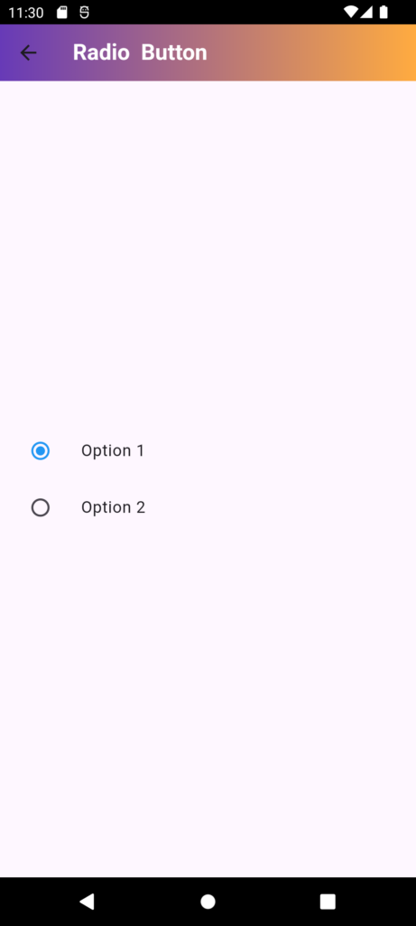
In Flutter, a Radio button is a widget that allows users to select one option from a group of mutually exclusive options. It is a circular button that can be either checked (selected) or unchecked (unselected). The visual representation includes:
- Checked State: The circle is filled, indicating that the option is selected.
- Unchecked State: The circle is empty, indicating that the option is not selected.
Radio buttons are often used in forms, settings, and other user interfaces where only one option should be selected at a time from a list of choices. They ensure that a single choice is made among multiple options, making them suitable for scenarios where mutual exclusivity is required.
Properties:
- value: The value of the RadioButton
- groupValue: The current value of the group (the selected option)
- onChanged: A callback function called when the user selects the
RadioButton - activeColor: The color of the RadioButton when selected
- focusColor: The color of the RadioButton when focused
- hoverColor: The color of the RadioButton when hovered
- overlayColor: The color of the overlay when the
RadioButtonis selected
Code:
import 'package:flutter/material.dart';

// Define a StatefulWidget for the radio button demonstration
class RadiobuttonDemo extends StatefulWidget {
  const RadiobuttonDemo({Key? key}) : super(key: key);

  @override
  State<RadiobuttonDemo> createState() => _RadiobuttonDemoState();
}

class _RadiobuttonDemoState extends State<RadiobuttonDemo> {
  // This variable holds the currently selected value from the radio button group
  int _groupValue = 1;

  @override
  Widget build(BuildContext context) {
    // Build the widget tree
    return SafeArea(
      child: Scaffold(
        // AppBar to display the title and gradient background
        appBar: AppBar(
          title: Text(
            "Radio Button",
            style: TextStyle(
              color: Colors.white,
              fontWeight: FontWeight.bold,
            ),
          ),
          flexibleSpace: Container(
            decoration: BoxDecoration(
              gradient: LinearGradient(
                colors: [Colors.deepPurple, Colors.orangeAccent],
                begin: Alignment.topLeft,
                end: Alignment.topRight,
              ),
            ),
          ),
        ),
        body: Column(
          // Center the radio buttons vertically on the screen
          mainAxisAlignment: MainAxisAlignment.center,
          children: [
            // First radio button option
            ListTile(
              title: Text('Option 1'), // Label for the radio button
              leading: Radio<int>(
                value: 1, // Value assigned to this radio button
                groupValue: _groupValue, // The currently selected value in the group
                onChanged: (int? value) {
                  // Callback triggered when this radio button is selected
                  setState(() {
                    _groupValue = value!; // Update the selected value
                  });
                },
                activeColor: Colors.blue, // Color of the radio button when selected
              ),
            ),
            // Second radio button option
            ListTile(
              title: Text('Option 2'), // Label for the radio button
              leading: Radio<int>(
                value: 2, // Value assigned to this radio button
                groupValue: _groupValue, // The currently selected value in the group
                onChanged: (int? value) {
                  // Callback triggered when this radio button is selected
                  setState(() {
                    _groupValue = value!; // Update the selected value
                  });
                },
                activeColor: Colors.blue, // Color of the radio button when selected
              ),
            ),
          ],
        ),
      ),
    );
  }
}





1 thought on “RadioButton In Flutter”