A toggle button is a graphical user interface element that allows users to switch between two or more states, such as on/off, yes/no, or true/false. It is a type of button that toggles between two states each time it is pressed.
characteristics:
- Two states: Toggle buttons have two distinct states, often represented by different icons, colors, or text.
- Switching behavior: Clicking or pressing the button toggles it between the two states.
- Binary option: Toggle buttons typically represent a binary option, where one state is the opposite of the other.
Where to use
- Light switch: on/off
- Volume control: mute/unmute
- Boolean checkbox: true/false
Radio Button vs Toggle Button:
While both radio buttons and toggle buttons are used for selection and switching, they serve different purposes and have distinct characteristics.
Radio Button:
- Multiple options: Radio buttons allow users to select one option from a group of mutually exclusive options.
- Single selection: Only one radio button can be selected at a time.
- Non-toggle: Radio buttons do not toggle between states; instead, they select a single option.
Toggle Button:
- Two states: Toggle buttons switch between two states, such as on/off or yes/no.
- Binary option: Toggle buttons represent a binary option, where one state is the opposite of the other.
- Toggle behavior: Toggle buttons toggle between states each time they are pressed.
Custom Toggle Button:
bool _isToggled = false;

Widget build(BuildContext context) {
  return GestureDetector(
    onTap: () {
      setState(() {
        _isToggled = !_isToggled;
      });
    },
    child: Container(
      width: 50,
      height: 25,
      decoration: BoxDecoration(
        borderRadius: BorderRadius.circular(25),
        color: _isToggled ? Colors.blue : Colors.grey,
      ),
      child: Row(
        children: [
          _isToggled
              ? Icon(Icons.check, color: Colors.white)
              : Icon(Icons.close, color: Colors.white),
        ],
      ),
    ),
  );
}
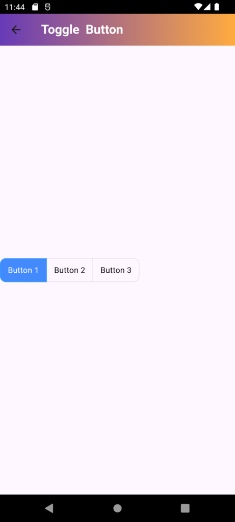
import 'package:flutter/material.dart';
class TogglebuttonDemo extends StatefulWidget {
const TogglebuttonDemo({Key? key}) : super(key: key);
@override
State<TogglebuttonDemo> createState() => _TogglebuttonDemoState();
}
class _TogglebuttonDemoState extends State<TogglebuttonDemo> {
@override
Widget build(BuildContext context) {
List<bool> _isSelected = [true, false, false];
return SafeArea(
child: Scaffold(
appBar: AppBar(
title: Text("Toggle Button",style: TextStyle(color: Colors.white,fontWeight: FontWeight.bold),),
flexibleSpace: Container(
decoration: BoxDecoration(
gradient: LinearGradient(
colors: [Colors.deepPurple, Colors.orangeAccent],
begin: Alignment.topLeft,
end: Alignment.topRight,
)
),
),
),
body: Column(
mainAxisAlignment: MainAxisAlignment.center,
children: [
ToggleButtons(
isSelected: _isSelected,
onPressed: (int index) {
setState(() {
_isSelected[index] = !_isSelected[index];
});
},
borderRadius: BorderRadius.circular(10),
selectedBorderColor: Colors.blue,
selectedColor: Colors.white,
fillColor: Colors.blueAccent,
color: Colors.black,
constraints: BoxConstraints(
minHeight: 40.0,
minWidth: 80.0,
),
children: [
Text('Button 1'),
Text('Button 2'),
Text('Button 3'),
],
)
],
),
),
);
}
}