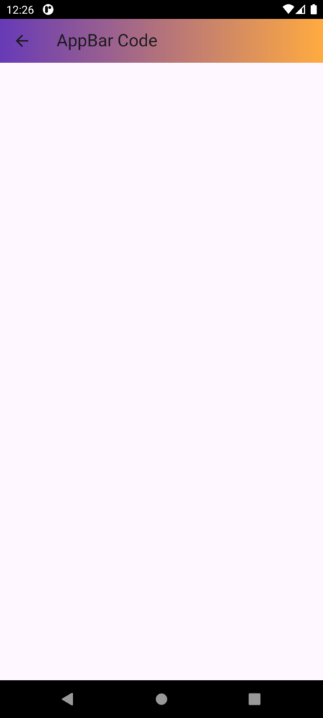
In Flutter, an AppBar is a widget that displays a top appbar with a title, actions, and navigation menu. It is a built-in widget that implements the basic material design visual layout structure for the top appbar.
Properties
- title: The title of the app bar
- actions: A list of widgets to be displayed as actions on the right side of the app bar
- leading: A widget to be displayed on the left side of the app bar (e.g., a navigation menu icon)
- backgroundColor: The background color of the app bar
- elevation: The elevation of the app bar (i.e., its shadow)
- brightness: The brightness of the app bar (i.e., light or dark)
Example
AppBar(
  title: Text('Hello, World!'),
  actions: [
    IconButton(icon: Icon(Icons.search), onPressed: () {}),
    IconButton(icon: Icon(Icons.notifications), onPressed: () {}),
  ],
  leading: IconButton(icon: Icon(Icons.menu), onPressed: () {}),
)
//This code creates an app bar with a title, two actions (search and notifications), and a leading navigation menu icon.
Use cases
- Create a top app bar with a title and actions
- Implement a navigation menu
- Display a search bar or other input field in the app bar
- Show notifications or other status indicators in the app bar
Code:
import 'package:flutter/material.dart';

class Appbarcode extends StatefulWidget {
  const Appbarcode({Key? key}) : super(key: key);

  @override
  State<Appbarcode> createState() => _AppbarcodeState();
}

class _AppbarcodeState extends State<Appbarcode> {
  @override
  Widget build(BuildContext context) {
    return Scaffold(
      // Provides the basic layout structure with an AppBar and body
      appBar: AppBar(
        // The AppBar widget displays a material design app bar at the top of the screen
        title: Text(
          'AppBar Code',
          // Title text displayed in the AppBar
        ),
        flexibleSpace: Container(
          // Container used to customize the background of the AppBar
          decoration: BoxDecoration(
            // BoxDecoration allows applying decoration to the Container
            borderRadius: BorderRadius.circular(10),
            // Rounded corners with a radius of 10 pixels
            gradient: LinearGradient(
              // Creates a gradient effect for the AppBar background
              colors: [Colors.deepPurple, Colors.orangeAccent],
              // Colors of the gradient
              begin: Alignment.topLeft,
              // Gradient starts from the top-left corner
              end: Alignment.topRight,
              // Gradient ends at the top-right corner
            ),
          ),
        ),
        actions: [
          // List of widgets displayed at the end of the AppBar
          Icon(
            Icons.arrow_back,
            color: Colors.white,
            // Sets the icon color to white
          ),
        ],
      ),
    );
  }
}