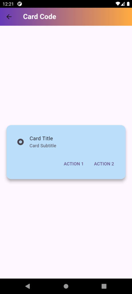
In Flutter, a Card is a widget that displays a piece of information in a visually appealing way, with a Material Design-inspired look and feel. It’s a versatile widget that can be used to display various types of content, such as:
- Text
- Images
- Icons
- Buttons
- Other widgets
A Card typically has a:
- Container: A rectangular container with a slight elevation, giving it a 3D effect.
- Padding: Space between the container’s edges and its content.
- Content: The actual information displayed inside the card.
- Border: A subtle border around the container.
You can customize a Card by modifying its properties, such as:
- Elevation: The shadow effect, makes it appear raised.
- Color: The background color of the card.
- Shape: The shape of the card (e.g., rounded corners).
- Border radius: The curvature of the card’s corners.
- Padding: The space between the content and the container’s edges.
Simple Example:
Card(
child: Padding(
padding: const EdgeInsets.all(16.0),
child: Text('Coder ICU'),
),
)
Example of a Card widget that uses all the properties mentioned:
Card(
elevation: 10, // Shadow effect
color: Colors.blue, // Background color
shape: RoundedRectangleBorder( // Shape with rounded corners
borderRadius: BorderRadius.circular(20), // Border radius
),
child: Padding(
padding: const EdgeInsets.all(20), // Padding
child: Text(
'Coder ICU!',
style: TextStyle(color: Colors.white),
),
),
)
import 'package:flutter/material.dart';
// Define a StatefulWidget named Cardcode
class Cardcode extends StatefulWidget {
const Cardcode({Key? key}) : super(key: key);
@override
State<Cardcode> createState() => _CardcodeState();
}
// Define the state for Cardcode
class _CardcodeState extends State<Cardcode> {
@override
Widget build(BuildContext context) {
// Build the widget tree
return Scaffold(
// Scaffold provides the basic structure for the visual layout of the app
appBar: AppBar(
// AppBar widget displays a material design app bar at the top of the screen
title: Text(
"Card Code",
style: TextStyle(
fontWeight: FontWeight.bold, // Makes the text bold
color: Colors.white, // Sets the text color to white
),
),
flexibleSpace: Container(
// Container allows for decoration and positioning of its child
decoration: BoxDecoration(
// BoxDecoration allows you to style the container
borderRadius: BorderRadius.circular(10), // Rounds the corners of the app bar
gradient: LinearGradient(
// LinearGradient creates a gradient effect
colors: [Colors.deepPurple, Colors.orangeAccent], // Colors for the gradient
begin: Alignment.topLeft, // Gradient starts from the top-left
end: Alignment.topRight, // Gradient ends at the top-right
),
),
),
),
body: Center(
// Center widget centers its child within the parent
child: Card(
// Card is a material design card with elevation and other properties
color: Colors.blue[100], // Sets the card's background color
elevation: 8.0, // Adds shadow to give the card a lifted effect
shape: RoundedRectangleBorder(
// Shape defines the card's border and corner radius
borderRadius: BorderRadius.circular(15.0), // Rounds the corners of the card
),
margin: EdgeInsets.all(20.0), // Sets the margin around the card
clipBehavior: Clip.antiAlias, // Clips the content to prevent overflow of rounded corners
shadowColor: Colors.grey, // Sets the color of the card's shadow
semanticContainer: true, // Allows the card to be used in accessibility contexts
child: Padding(
// Padding adds space inside the card between its content and edges
padding: const EdgeInsets.all(16.0), // Sets padding to 16 logical pixels on all sides
child: Column(
// Column arranges its children vertically
mainAxisSize: MainAxisSize.min, // Sizes the column to fit its children
children: [
ListTile(
// ListTile is a convenient widget to display a leading icon, title, and subtitle
leading: Icon(Icons.album), // Displays an icon to the left
title: Text('Card Title'), // Title text of the card
subtitle: Text('Card Subtitle'), // Subtitle text of the card
),
ButtonBar(
// ButtonBar arranges buttons horizontally and aligns them at the bottom
children: [
TextButton(
// TextButton is a button that displays text and reacts to taps
child: Text('ACTION 1'), // Text displayed on the button
onPressed: () {
// Callback when the button is pressed
},
),
TextButton(
child: Text('ACTION 2'), // Text displayed on the button
onPressed: () {
// Callback when the button is pressed
},
),
],
),
],
),
),
),
),
);
}
}
