
A “ListView in Flutter” is a widget that displays a list of children in a scrollable view. It is a convenient way to display a collection of items in a vertical or horizontal list.
Types of “ListView”
There are several types of ListView in Flutter:
- ListView: A basic “ListView” that displays a list of children.
- ListView.builder: A “ListView” that builds its children on demand, useful for large lists.
- ListView.separated: A “ListView” that separates its children with a divider.
- ListView.custom: A “ListView” that allows for a custom child widget.
Some common properties of “ListView” include:
- children: The list of widgets to display.
- itemCount: The number of items in the list.
- itemBuilder: A function that builds each item in the list.
- separatorBuilder: A function that builds the separator between items.
- scrollDirection: The direction of the scroll, either vertical or horizontal.
Example of a simple “ListView“:
ListView(
  children: [
    ListTile(title: Text('Item 1')),
    ListTile(title: Text('Item 2')),
    ListTile(title: Text('Item 3')),
  ],
)
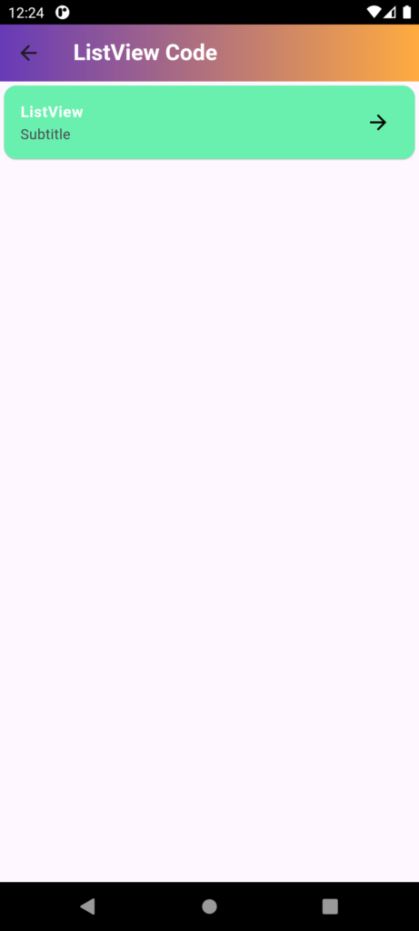
import 'package:flutter/material.dart';
class ListviewDEMo extends StatefulWidget {
const ListviewDEMo({Key? key}) : super(key: key);
@override
State<ListviewDEMo> createState() => _ListviewDEMoState();
}
class _ListviewDEMoState extends State<ListviewDEMo> {
@override
Widget build(BuildContext context) {
return SafeArea(
// Ensures that the widget is displayed within the safe area of the device, avoiding system UI intrusions
child: Scaffold(
// Scaffold provides a basic material design layout structure
appBar: AppBar(
// AppBar is the top bar of the application with a title
title: Text(
"ListView Code",
style: TextStyle(
fontWeight: FontWeight.bold,
color: Colors.white,
),
),
// Customizing the appearance of the AppBar
flexibleSpace: Container(
// Container is used to decorate the AppBar with a gradient
decoration: BoxDecoration(
gradient: LinearGradient(
colors: [Colors.deepPurple, Colors.orangeAccent],
begin: Alignment.topLeft,
end: Alignment.topRight,
),
),
),
),
body: ListView(
// ListView displays a scrollable list of widgets
children: [
Card(
// Card is used to display content with a material design look and feel
color: Colors.greenAccent,
// Setting the background color of the Card
child: ListTile(
// ListTile is a material design list item
title: Text(
"ListView",
style: TextStyle(
fontSize: 15,
color: Colors.white,
fontWeight: FontWeight.bold,
),
),
// Title of the ListTile
subtitle: Text("Subtitle"),
// Subtitle of the ListTile
trailing: Icon(
Icons.arrow_forward,
color: Colors.black,
),
// Trailing widget of the ListTile, usually used for icons or actions
),
),
],
),
),
);
}
}
“ListView” serves a specific purpose, and choosing the right one depends on the needs of your app.
- “ListView” is suitable for small, fixed lists.
- ListView.builder is ideal for large, dynamic lists.
- ListView.separated is useful when you want to visually separate items.
- ListView.custom offers flexibility for unique list layouts.
Here is the syntax for each type of “ListView“:
1. ListView
ListView(
  children: [
    // List of widgets
  ],
)
2. ListView.builder
ListView.builder(
  itemCount: // Number of items,
  itemBuilder: (context, index) {
    // Return a widget for each item
  },
)
3. ListView.separated
ListView.separated(
  itemCount: // Number of items,
  itemBuilder: (context, index) {
    // Return a widget for each item
  },
  separatorBuilder: (context, index) {
    // Return a widget for each separator
  },
)
4. ListView.custom
ListView.custom(
  childrenDelegate: SliverChildBuilderDelegate(
    (context, index) {
      // Return a widget for each item
    },
    childCount: // Number of items,
  ),
)






2 thoughts on “ListView in Flutter”