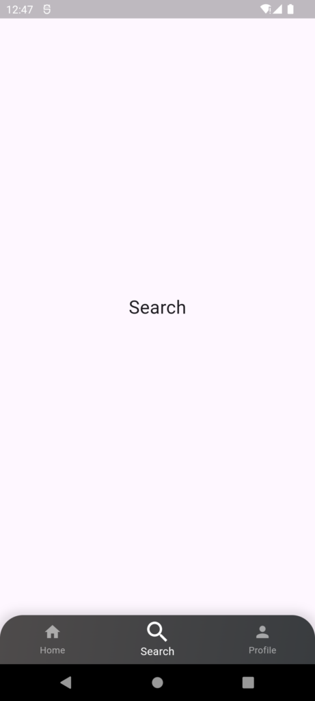
The BottomNavigationBar widget in Flutter is a material design widget used to create a bottom navigation bar in an app. It’s commonly used to navigate between different pages or sections of an app. The bar is typically displayed at the bottom of the screen and contains multiple items, each representing a different page or feature within the app. When a user taps on a BottomNavigationBar item, the app usually navigates to the corresponding page or updates the content displayed in the current page.
Key Features of BottomNavigationBar
- Navigation Between Screens: It allows users to navigate between different pages or sections of an app using the bar at the bottom of the screen.
- Customizable Appearance: You can customize the appearance, such as colors, icons, labels, and background, to match the theme of your app.
- Support for Different Types:
- BottomNavigationBarType
.fixed: All items are shown in a fixed position, ideal for up to four or five items. - BottomNavigationBarType
.shifting: Items shift their position to emphasize the selected item, ideal for more than four items.
- BottomNavigationBarType
- Responsive and Animated: It responds to user taps and can animate between selected items, providing a smooth user experience.
- Accessibility: Provides properties for tooltips, labels, and icons, making it accessible to a wide range of users, including those using screen readers.
Basic Properties
- items: A list of BottomNavigationBarItem objects that define the icons and labels for each item in the navigation bar.
- currentIndex: The index of the currently selected item.
- onTap: A callback function that is triggered when an item is tapped. It provides the index of the tapped item, allowing the developer to handle navigation or other actions.
- backgroundColor: The background color of the BottomNavigationBar.
- selectedItemColor: The color of the selected item.
- unselectedItemColor: The color of the unselected items.
- type: The layout behavior of the navigation bar. Can be BottomNavigationBarType.fixed or BottomNavigationBarType.shifting.
- showUnselectedLabels: A boolean that determines whether or not to show labels for unselected items.
Best Practices
Here are some best practices:
- Limit items: 3-5 items are recommended for optimal usability.
- Consistent design: Match the app’s overall design and style.
- Clear labels: Use concise and descriptive labels.
- Responsive design: Ensure navigation bar adapts to different screen sizes.
Example
import 'package:flutter/material.dart';

// HomeScreen is a StatefulWidget because it maintains the state of the selected index
class HomeScreen extends StatefulWidget {
  @override
  _HomeScreenState createState() => _HomeScreenState();
}

// State class for HomeScreen
class _HomeScreenState extends State<HomeScreen>
    with SingleTickerProviderStateMixin {
  int _selectedIndex = 0; // The index of the currently selected BottomNavigationBar item
  late AnimationController _animationController; // AnimationController to control the animations of icons

  // List of pages to display based on the selected BottomNavigationBar item
  final List<Widget> _pages = [
    Center(child: Text('Home', style: TextStyle(fontSize: 24))), // Home Page
    Center(child: Text('Search', style: TextStyle(fontSize: 24))), // Search Page
    Center(child: Text('Profile', style: TextStyle(fontSize: 24))), // Profile Page
  ];

  @override
  void initState() {
    super.initState();
    // Initialize the AnimationController with a duration and vsync provider
    _animationController = AnimationController(
      duration: const Duration(milliseconds: 500), // Animation duration
      vsync: this, // Provides a TickerProvider for animations
    );
  }

  @override
  void dispose() {
    // Dispose the AnimationController to free resources
    _animationController.dispose();
    super.dispose();
  }

  // Function to handle item tap events on the BottomNavigationBar
  void _onItemTapped(int index) {
    setState(() {
      _selectedIndex = index; // Update the selected index
      _animationController.forward(from: 0.0); // Start the animation from the beginning
    });
  }

  @override
  Widget build(BuildContext context) {
    return Scaffold(
      // Display the page based on the selected index
      body: _pages[_selectedIndex],
      // Custom styled BottomNavigationBar with gradient and rounded corners
      bottomNavigationBar: Container(
        decoration: BoxDecoration(
          gradient: LinearGradient(
            colors: [Colors.black, const Color.fromARGB(255, 57, 60, 63)], // Gradient colors
            begin: Alignment.topLeft, // Gradient start position
            end: Alignment.bottomRight, // Gradient end position
          ),
          boxShadow: [
            BoxShadow(
              color: Colors.black12, // Shadow color
              spreadRadius: 5, // Spread radius of the shadow
              blurRadius: 10, // Blur radius of the shadow
            ),
          ],
          borderRadius: BorderRadius.only(
            topLeft: Radius.circular(30.0), // Top-left rounded corner
            topRight: Radius.circular(30.0), // Top-right rounded corner
          ),
        ),
        child: ClipRRect(
          borderRadius: BorderRadius.only(
            topLeft: Radius.circular(30.0), // Clip to match the border radius
            topRight: Radius.circular(30.0), // Clip to match the border radius
          ),
          // BottomNavigationBar with custom animated icons
          child: BottomNavigationBar(
            items: <BottomNavigationBarItem>[
              // Home Icon with animation
              BottomNavigationBarItem(
                icon: AnimatedIconItem(
                  icon: Icons.home,
                  isSelected: _selectedIndex == 0, // Check if this item is selected
                  animationController: _animationController, // Pass the animation controller
                ),
                label: 'Home', // Label for the item
              ),
              // Search Icon with animation
              BottomNavigationBarItem(
                icon: AnimatedIconItem(
                  icon: Icons.search,
                  isSelected: _selectedIndex == 1, // Check if this item is selected
                  animationController: _animationController, // Pass the animation controller
                ),
                label: 'Search', // Label for the item
              ),
              // Profile Icon with animation
              BottomNavigationBarItem(
                icon: AnimatedIconItem(
                  icon: Icons.person,
                  isSelected: _selectedIndex == 2, // Check if this item is selected
                  animationController: _animationController, // Pass the animation controller
                ),
                label: 'Profile', // Label for the item
              ),
            ],
            currentIndex: _selectedIndex, // The currently selected index
            onTap: _onItemTapped, // OnTap handler to change the selected index
            showUnselectedLabels: true, // Show labels for unselected items
            selectedItemColor: Colors.white, // Color for the selected item
            unselectedItemColor: Colors.white54, // Color for unselected items
            backgroundColor: Colors.transparent, // Background color set to transparent
            elevation: 0, // No elevation
            type: BottomNavigationBarType.fixed, // Fixed type to show all items
          ),
        ),
      ),
    );
  }
}

// AnimatedIconItem is a custom widget that handles the animation of icons
class AnimatedIconItem extends StatelessWidget {
  final IconData icon; // Icon to display
  final bool isSelected; // Whether this icon is selected
  final AnimationController animationController; // Animation controller

  AnimatedIconItem({
    required this.icon,
    required this.isSelected,
    required this.animationController,
  });

  @override
  Widget build(BuildContext context) {
    // AnimatedBuilder rebuilds the widget whenever the animationController changes
    return AnimatedBuilder(
      animation: animationController,
      builder: (context, child) {
        // Transform widget is used to scale the icon for the animation effect
        return Transform.scale(
          scale: isSelected ? 1.2 : 1.0, // Scale up if selected, otherwise normal size
          child: Icon(
            icon,
            color: isSelected ? Colors.white : Colors.white54, // Color based on selection
            size: isSelected ? 30 : 24, // Size based on selection
          ),
        );
      },
    );
  }
}
