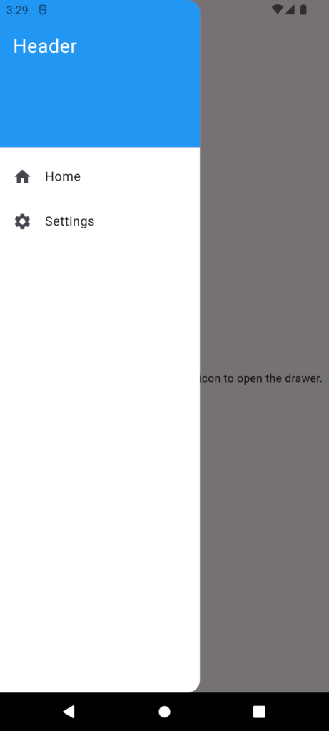
a Drawer in flutter is a widget that provides a sliding panel, typically used for navigation or displaying additional information. It’s a common pattern in mobile apps, where the user can swipe from the edge of the screen to reveal a menu or other content on Drawer in flutter.
Here’s a breakdown of the Drawer widget:
Properties:
- child: The content of the drawer, which can be any widget.
- elevation: The elevation of the drawer, which affects its shadow.
- width: The width of the drawer, which can be specified as a double (pixels) or a fraction of the screen width.
- semanticLabel: A label for accessibility purposes, describing the drawer.
- backgroundColor: Sets the background color of the drawer.
- scrimColor: The color of the scrim (overlay) that appears when the drawer is open.
- shape: Defines the shape of the drawer, such as rounded corners or borders. It takes a ShapeBorder object.
How it works:
- You create a Drawer widget and pass it a child widget, which will be displayed inside the drawer.
- The Drawer widget is typically placed in a Scaffold widget, which provides a basic material design visual layout structure.
- When the user swipes from the edge of the screen (or taps the hamburger menu icon), the Drawer widget is displayed, overlaying the main content.
- The user can interact with the content inside the Drawer widget.
- When the user closes the Drawer (by swiping, tapping outside, or pressing the back button), it disappears, and the main content is revealed again.
Example:
Example
import 'package:flutter/material.dart';

class MyHomePage extends StatelessWidget {
  // Define a GlobalKey for the Scaffold
  final GlobalKey<ScaffoldState> _scaffoldKey = GlobalKey<ScaffoldState>();

  @override
  Widget build(BuildContext context) {
    return Scaffold(
      key: _scaffoldKey, // Assign the GlobalKey to the Scaffold
      appBar: AppBar(
        title: Text('Drawer Example'),
        automaticallyImplyLeading:
            false, // Set to false to control leading button
        leading: IconButton(
          icon: Icon(Icons.menu),
          onPressed: () => _scaffoldKey.currentState
              ?.openDrawer(), // Use GlobalKey to open drawer
        ),
      ),
      drawer: Drawer(
        // Using all properties of Drawer
        child: ListView(
          padding: EdgeInsets.zero,
          children: <Widget>[
            DrawerHeader(
              decoration: BoxDecoration(
                color: Colors.blue,
              ),
              child: Text(
                'Header',
                style: TextStyle(
                  color: Colors.white,
                  fontSize: 24,
                ),
              ),
            ),
            ListTile(
              leading: Icon(Icons.home),
              title: Text('Home'),
              onTap: () {
                Navigator.pop(context); // Close the drawer
              },
            ),
            ListTile(
              leading: Icon(Icons.settings),
              title: Text('Settings'),
              onTap: () {
                Navigator.pop(context); // Close the drawer
              },
            ),
          ],
        ),
        elevation: 16.0, // Elevation for the drawer shadow
        backgroundColor: Colors.white, // Background color of the drawer
        width: 250.0, // Width of the drawer

        semanticLabel: 'Main Navigation Drawer', // Accessibility label

        shape: RoundedRectangleBorder(
          // Custom shape for the drawer
          borderRadius: BorderRadius.only(
            topRight: Radius.circular(16.0),
            bottomRight: Radius.circular(16.0),
          ),
        ),
      ),
      body: Center(
        child: Text(
            'Swipe from the left or click the menu icon to open the drawer.'),
      ),
    );
  }
}
