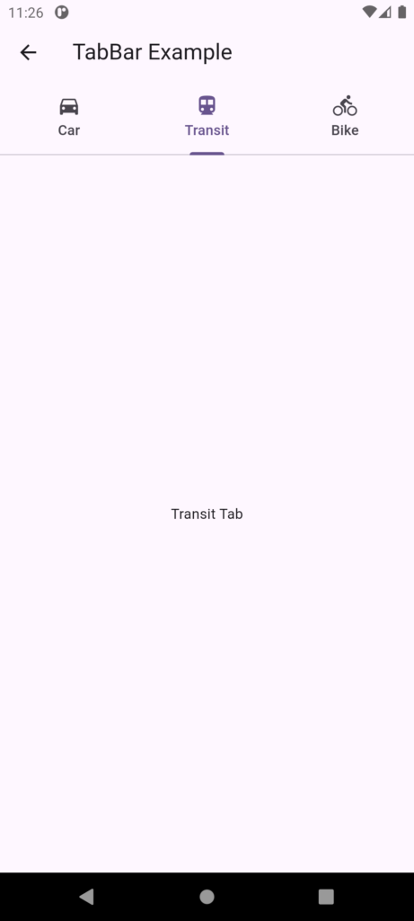
A TabBar in Flutter is a material design widget that displays a horizontal row of tabs. It’s typically used in conjunction with a TabController to switch between different views or pages.
Properties:
- tabs: A list of Tab widgets to be displayed in the tab bar.
- controller: The TabController that manages the tab bar’s state.
- isScrollable: Whether the tab bar is scrollable or not.
- indicatorColor: The color of the tab indicator.
- indicatorWeight: The weight of the tab indicator.
- indicatorPadding: The padding of the tab indicator.
- indicatorSize: The size of the tab indicator.
- labelColor: The color of the tab labels.
- labelStyle: The style of the tab labels.
- unselectedLabelColor: The color of the unselected tab labels.
- unselectedLabelStyle: The style of the unselected tab labels.
Where to use:
- Typically used in conjunction with a TabBarView to switch between different views or pages.
- Often used in the AppBar widget to display a tab bar at the top of the screen.
- Can be used in a custom widget to create a custom tab bar.
TabBar vs BottomNavigationBar
Both TabBar and BottomNavigationBar are used for navigation in Flutter, but they serve different purposes and have different characteristics.
TabBar:
- Displays a horizontal row of tabs, typically at the top of the screen.
- Each tab is associated with a specific view or page.
- Tabs are meant to be used when there are multiple views or pages that are closely related.
- Typically used in conjunction with a TabBarView to switch between views.
- Can be used in an AppBar or as a standalone widget.
BottomNavigationBar:
- Displays a horizontal row of icons or text labels at the bottom of the screen.
- Each item is associated with a specific route or page.
- Items are meant to be used when there are multiple routes or pages that are not necessarily related.
- Typically used to switch between different routes or pages.
- Can be used with a Scaffold to display the bottom navigation bar.
Key differences:
- Position: TabBar is typically used at the top of the screen, while BottomNavigationBar is used at the bottom.
- Purpose: TabBar is used for switching between related views or pages, while BottomNavigationBar is used for switching between unrelated routes or pages.
- Appearance: TabBar displays tabs with labels and icons, while BottomNavigationBar displays icons or text labels.
When to use each:
- Use TabBar when you have multiple views or pages that are closely related and need to be switched between, such as different sections of a settings page.
- Use BottomNavigationBar when you have multiple routes or pages that are not necessarily related and need to be switched between, such as different features of an app.
Example:
- A settings page with multiple sections (e.g., account, notifications, etc.) would use a TabBar.
- A social media app with multiple features (e.g., feed, messages, profile, etc.) would use a BottomNavigationBarTabTa.
TabBar Example
import 'package:flutter/material.dart';

// The main screen widget that includes the TabBar and TabBarView
class TabBarExample extends StatelessWidget {
  @override
  Widget build(BuildContext context) {
    // DefaultTabController manages the state for the TabBar and TabBarView
    return DefaultTabController(
      length: 3, // Number of tabs
      child: Scaffold(
        appBar: AppBar(
          title: Text('TabBar Example'), // Title displayed in the AppBar
          bottom: TabBar(
            // Customizing the TabBar
            indicatorPadding: EdgeInsets.symmetric(horizontal: 5), // Padding around the tab indicator to prevent overflow
            tabs: [
              // Define each tab with an icon and text
              Tab(
                icon: Icon(Icons.directions_car), // Icon for the first tab
                text: 'Car', // Text for the first tab
              ),
              Tab(
                icon: Icon(Icons.directions_transit), // Icon for the second tab
                text: 'Transit', // Text for the second tab
              ),
              Tab(
                icon: Icon(Icons.directions_bike), // Icon for the third tab
                text: 'Bike', // Text for the third tab
              ),
            ],
          ),
        ),
        // The body of the Scaffold, displaying different views for each tab
        body: TabBarView(
          // Each child corresponds to a tab in the TabBar
          children: [
            Center(child: Text('Car Tab')), // Content for the 'Car' tab
            Center(child: Text('Transit Tab')), // Content for the 'Transit' tab
            Center(child: Text('Bike Tab')), // Content for the 'Bike' tab
          ],
        ),
      ),
    );
  }
}
