A Container is a versatile and fundamental widget used for creating a rectangular visual element with various properties. It is often used as a building block for UI design and layout in Flutter applications. The Container widget allows you to apply styling, positioning, and decoration to its child widget or to itself.
In Flutter, a Container is a widget that allows you to create a rectangular box with a specific width, height, and decoration. It is a built-in widget in Flutter that can be used to wrap other widgets and apply various styles, such as:
- Background color
- Border
- Padding
- Margin
- Width and height
- Decoration (e.g., gradient, image)
A Container widget is useful when you want to:
- Create a custom layout
- Apply a consistent design theme
- Add space between widgets
- Create a clickable area
Properties of a Container widget in Flutter:
- child: The widget to be displayed inside the container.
- alignment: Specifies how to align the child widget within the container.
- width and
height: The size of the container. - color: The background color of the container.
- padding: The space between the container’s border and its child.
- margin: The space between the container and its parent widget.
- decoration: A
BoxDecorationobject that allows you to customize the container’s appearance, including: - border: A
Borderobject that defines the container’s border. - borderRadius: A
BorderRadiusobject that defines the container’s corner radius. - boxShadow: A list of
BoxShadowobjects that define the container’s shadow. - gradient: A
Gradientobject that defines the container’s gradient background. - image: A
DecorationImagethe object that defines the container’s background image. - foregroundDecoration: A
BoxDecorationobject that allows you to customize the container’s foreground appearance. - transform: A
Matrix4object that defines the container’s transformation. - clipBehavior: Specifies how to clip the container’s child.
- constraints: Specifies the constraints for the container’s size.
Container(
  width: 200,
  height: 100,
  color: Colors.blue,
  child: Center(
    child: Text('Coder ICU!'),
  ),
)
Detailed Example with Multiple Properties:
Container(
  // The decoration property allows you to customize the visual appearance of the container.
  decoration: BoxDecoration(
    // Sets the background color of the container.
    color: Colors.white,  // White background color

    // Applies rounded corners to the container.
    borderRadius: BorderRadius.circular(12.0),  // 12.0 radius for all corners

    // Adds a border around the container.
    border: Border.all(
      // Sets the color of the border.
      color: Colors.black,  // Black border color

      // Sets the width of the border.
      width: 2.0,  // 2.0 width for the border
    ),

    // Adds shadow effects to the container.
    boxShadow: [
      BoxShadow(
        // Defines the color of the shadow with some transparency.
        color: Colors.black.withOpacity(0.2),  // Shadow color with 20% opacity

        // Determines the spread radius of the shadow.
        spreadRadius: 4,  // Shadow spreads out by 4 units

        // Sets the blur radius for the shadow.
        blurRadius: 8,  // Shadow blur radius of 8 units

        // Defines the offset of the shadow relative to the container.
        offset: Offset(0, 4),  // Shadow is offset by 4 units downward (no horizontal offset)
      ),
    ],

    // Applies a gradient background to the container.
    gradient: LinearGradient(
      // Specifies the colors used in the gradient.
      colors: [Colors.blue, Colors.purple],  // Gradient transitions from blue to purple

      // Sets the starting point of the gradient.
      begin: Alignment.topLeft,  // Gradient starts from the top-left corner

      // Sets the ending point of the gradient.
      end: Alignment.bottomRight,  // Gradient ends at the bottom-right corner
    ),
  ),

  // The child property contains the content inside the container.
  child: Center(
    // Center widget aligns its child widget in the center of the container.
    child: Text(
      'Styled Container with Decoration',
      // Defines the style of the text widget.
      style: TextStyle(
        color: Colors.white,  // White color for the text to contrast with the background
      ),
    ),
  ),
)
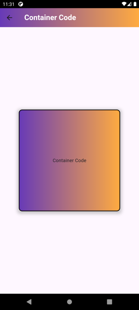
 import 'package:flutter/material.dart';
class ContinerCode extends StatefulWidget {
  const ContinerCode({Key? key}) : super(key: key);

  @override
  State<ContinerCode> createState() => _ContinerCodeState();
}

class _ContinerCodeState extends State<ContinerCode> {
  @override
  Widget build(BuildContext context) {
    return Scaffold(
      appBar: AppBar(
        title: Text("Container Code",style: TextStyle(fontWeight: FontWeight.bold,color: Colors.white),),
        flexibleSpace: Container(
          decoration: BoxDecoration(
            borderRadius: BorderRadius.circular(10),
            gradient: LinearGradient(
                colors: [Colors.deepPurple, Colors.orangeAccent],
                begin: Alignment.topLeft,
                end: Alignment.topRight
            ),
          ),
        ),
      ),
      body: Container(
        decoration: BoxDecoration(
          borderRadius: BorderRadius.circular(10),
          border: Border.all(color: Colors.black, width: 2.0),
          gradient: LinearGradient(
            colors: [Colors.deepPurple, Colors.orangeAccent],
            begin: Alignment.topLeft,
            end: Alignment.topRight
          ),
          boxShadow: [
            BoxShadow(
              color: Colors.grey.withOpacity(0.5),
              spreadRadius: 5,
              blurRadius: 7,
              offset: Offset(0, 3),
            ),
          ],
        ),
        alignment: Alignment.center,
        child: Text("Container Code"),
      )
    );
  }
}
