
In Flutter, a ListTile is a single fixed-height row that contains a leading widget, a title, a subtitle, and a trailing widget. It’s a convenient widget for creating list items with a consistent layout.
breakdown of its components:
- Leading: A widget that appears at the beginning of the row, typically an icon or an image.
- Title: The primary text of the list item, usually a Text widget.
- Subtitle: Secondary text that appears below the title, also a Text widget.
- Trailing: A widget that appears at the end of the row, often an icon or a button.
ListTile is commonly used in ListView, Column, or other widgets that require a list of items. It’s a versatile widget that can be customized to fit various design needs.
Properties:
- leading: A widget that appears at the beginning of the row. It’s usually an icon or an image, but can be any widget.
- title: The primary text of the list item. It’s usually a Text widget, but can be any widget.
- subtitle: Secondary text that appears below the title. It’s usually a Text widget, but can be any widget.
- trailing: A widget that appears at the end of the row. It’s usually an icon or a button, but can be any widget.
- dense: A boolean that controls the height of the ListTile. If
true, the height is reduced. - contentPadding: The padding around the content of the ListTile.
- enabled: A boolean that controls whether the ListTile is enabled or disabled. If false, the ListTile is grayed out.
- onTap: A callback function that’s called when the ListTile is tapped.
- onLongPress: A callback function that’s called when the ListTile is long-pressed.
Styling
- ListTile has a default style that can be customized using the style property.
- You can also use the
themeproperty to customize the colors and typography of the ListTile.
Use cases
- ListTile is commonly used in ListView, Column, or other widgets that require a list of items.
- It’s often used to display a list of items with a consistent layout, such as a list of contacts, settings, or menu items.
- ListTile can also be used to create a list of clickable items, such as a navigation drawer or a list of actions.
Example:
import 'package:flutter/material.dart';

class ListTileDemo extends StatefulWidget {
  @override
  State<ListTileDemo> createState() => _ListTileDemoState();
}

class _ListTileDemoState extends State<ListTileDemo> {
  @override
  Widget build(BuildContext context) {
    return Scaffold(
      body: ListView(
        children: [
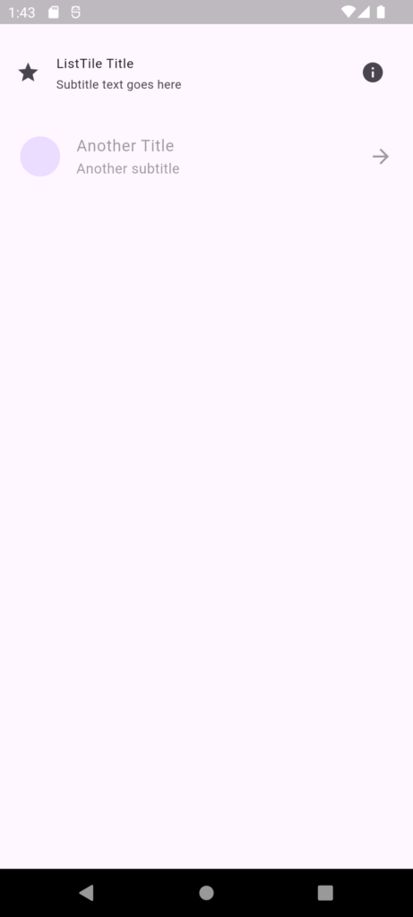
          ListTile(
            leading: Icon(Icons.star), // Widget displayed at the start
            title: Text('ListTile Title'), // Primary content
            subtitle: Text('Subtitle text goes here'), // Secondary content
            trailing: IconButton(
              icon: Icon(Icons.info),
              onPressed: () {
                // Action for trailing icon button
                print('Trailing icon pressed');
              },
            ), // Widget displayed at the end
            dense: true, // Reduces height of the ListTile
            contentPadding: EdgeInsets.all(16.0), // Padding around content
            enabled: true, // Determines if ListTile is interactive
            onTap: () {
              // Callback when tapped
              print('ListTile tapped');
            },
            onLongPress: () {
              // Callback when long-pressed
              print('ListTile long pressed');
            },
          ),
          ListTile(
            leading: CircleAvatar(
              backgroundImage: NetworkImage('https://example.com/image.jpg'),
            ), // Widget displayed at the start (image)
            title: Text('Another Title'),
            subtitle: Text('Another subtitle'),
            trailing: Icon(Icons.arrow_forward),
            dense: false, // Default height of the ListTile
            contentPadding:
                EdgeInsets.symmetric(horizontal: 20.0), // Custom padding
            enabled: false, // ListTile is visually disabled
            onTap: () {
              // This won't be triggered since enabled is false
              print('This tap will not work');
            },
            onLongPress: () {
              // This won't be triggered either
              print('This long press will not work');
            },
          ),
        ],
      ),
    );
  }
}






1 thought on “ListTile in Flutter”