In Flutter, a Stack is a widget that allows you to overlap multiple widgets on top of each other. It is a built-in widget that enables you to create complex layouts by stacking widgets vertically.
Properties
Here are the properties of a Stack widget:
- children: A list of widgets to be stacked on top of each other
- alignment: Specifies how to align the children within the stack (e.g., topLeft, center, bottomRight)
- textDirection: Specifies the text direction for the stack (e.g., ltr, rtl)
Example:
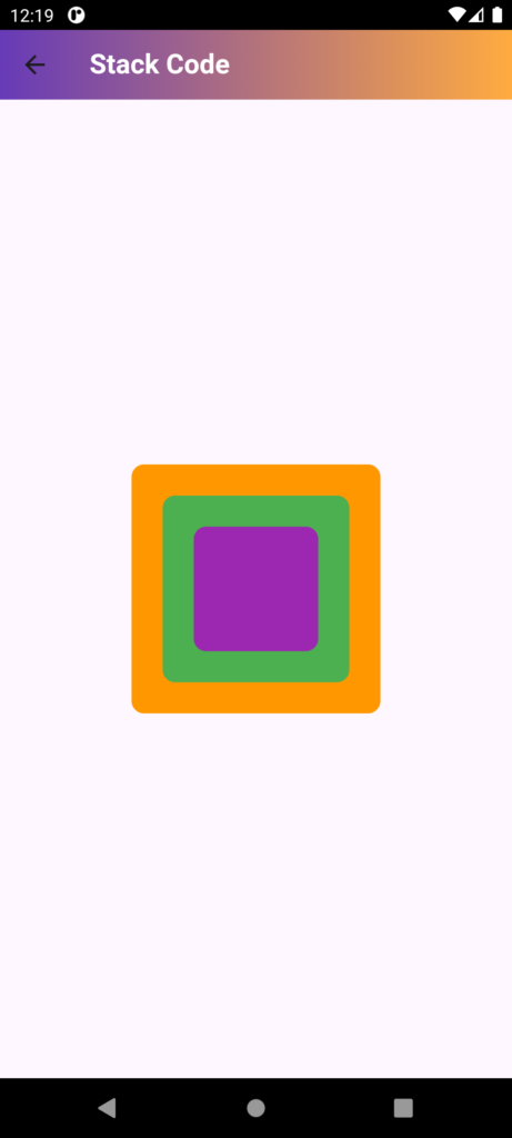
Stack(
  children: [
    Container(color: Colors.red, width: 200, height: 200),
    Container(color: Colors.green, width: 150, height: 150),
    Container(color: Colors.blue, width: 100, height: 100),
  ],
)
Use cases
- Create complex layouts with overlapping widgets
- Implement a card layout with overlapping elements
- Create a custom dialog or popup with stacked widgets
- Display a widget on top of another widget (e.g., a loading indicator on top of a list)
Also, you can use Stack with Positioned widget to position the children within the stack, for example:
Stack(
  children: [
    Positioned(top: 10, left: 10, child: Container(color: Colors.red, width: 50, height: 50)),
    Positioned(bottom: 10, right: 10, child: Container(color: Colors.green, width: 50, height: 50)),
  ],
)
Code:
import 'package:flutter/material.dart';

class StackCode extends StatefulWidget {
  const StackCode({Key? key}) : super(key: key);

  @override
  State<StackCode> createState() => _StackCodeState();
}

class _StackCodeState extends State<StackCode> {
  @override
  Widget build(BuildContext context) {
    return Scaffold(
      // Provides a structure for the application with an AppBar and body
      appBar: AppBar(
        // The AppBar widget at the top of the screen
        title: Text(
          "Stack Code",
          style: TextStyle(
            fontWeight: FontWeight.bold, // Makes the text bold
            color: Colors.white, // Sets the text color to white
          ),
        ),
        flexibleSpace: Container(
          // Container used to style the background of the AppBar
          decoration: BoxDecoration(
            borderRadius: BorderRadius.circular(10), // Adds rounded corners with radius of 10
            gradient: LinearGradient(
              // Creates a gradient effect for the background
              colors: [Colors.deepPurple, Colors.orangeAccent], // Gradient colors
              begin: Alignment.topLeft, // Gradient starts from the top-left
              end: Alignment.topRight, // Gradient ends at the top-right
            ),
          ),
        ),
      ),
      body: Center(
        // Centers the Stack widget in the body of the Scaffold
        child: Stack(
          // Stack widget allows for layering of children widgets on top of each other
          children: [
            Container(
              // First container in the stack
              height: 200, // Height of the container
              width: 200, // Width of the container
              decoration: BoxDecoration(
                borderRadius: BorderRadius.circular(10), // Adds rounded corners with radius of 10
                color: Colors.orange, // Background color of the container
              ),
            ),
            SizedBox(height: 10), // Adds vertical space between the stacked widgets
            Container(
              // Second container in the stack
              height: 200, // Height of the container
              width: 200, // Width of the container
              decoration: BoxDecoration(
                borderRadius: BorderRadius.circular(10), // Adds rounded corners with radius of 10
                color: Colors.green, // Background color of the container
              ),
            ),
            SizedBox(height: 10), // Adds vertical space between the stacked widgets
            Container(
              // Third container in the stack
              height: 200, // Height of the container
              width: 200, // Width of the container
              decoration: BoxDecoration(
                borderRadius: BorderRadius.circular(10), // Adds rounded corners with radius of 10
                color: Colors.purple, // Background color of the container
              ),
            ),
            SizedBox(height: 10), // Adds vertical space between the stacked widgets
          ],
        ),
      ),
    );
  }
}